 p. bhogale
 Markets and financial time series data.
Basic ideas about markets
Inevitably, finance and markets will be a recurring subject of discussion on this blog. They are ubiquitous, useful, fascinatingly complex at various levels and they generate a lot of readily accessible data.
What is a market ? A market is a system which enables traders to exchange commodities/assets at a mutually agreeable price. Every market has at its center a market maker - an entity which matches traders who want to buy at a certain price with traders who want to sell at that price.
No Arbitrage. The word arbitrage refers to a situation where the same asset has different prices in different locations. For instance, if Klingon Bat'Leths are available at 10USD a piece in Berlin and at 15USD a piece in Baghdad, and if the cost of transporting a Bat'Leth from Berlin to Baghdad is 1USD, then money can be made by buying Bat'Leths in Berlin and selling them in Baghdad. In fact, people will buy Bat'Leths in Berlin and sell them in Baghdad until the price of Bat'Leths increases in Berlin and decreases in Baghdad and there is no more profit to be made. In an ideal market, arbitrage is instantaneously washed out by traders making money off it. The no arbitrage condition implies that the market serves as a mechanism for price setting. Each commodity has a "rational" price decided in the market by balancing the forces of demand and supply.
The efficient market. A market is said to be efficient if all the information about a particular asset is instantly assimilated by the market and is immediately reflected in the price of the asset. This assumption has significant implications for the time series of the price of an asset traded on the market. Since Bachelier in 1900, it has been argued that an efficient market should imply that prices move randomly but a formal proof was presented by Samuelson in 1965 (pdf). The paper is readable to anyone with moderate exposure to probability theory and the principle result is that at the present time \(t\), given the historical time series of prices of a particular asset \(\{y_t,y_{t-1}.......y_0\}\), if the futures price of that asset to be delivered at time \(T>t\) is \(C(T,t)\), then the expected price at the next time point \(t+1\) is given by \(E\left\{C(T,t+1)\right\}=C(T,t)\). In other words, it is impossible to predict which way the price will move at the next time point based on the historical price data.
Before making this idea more intuitive, we will introduce market returns. If the price of an asset today is \(y_t\) and tomorrow it is \(y_{t+1}\), then the return an investor might have obtained by buying today and selling tomorrow is defined to be \(\frac{y_{t+1}-y_t}{y_t}\). It is more common in practice to use the logarithmic return defined by \(ln\left(\frac{y_{t+1}}{y_t}\right)\). It is useful to think of logarithmic returns being related to compound interest and normal returns being related to simple interest. If the price today was 100, and tomorrow is 110, then my return is 10% while my logarithmic return is 9.5%. The two methods of calculating return give approximately the same result but the logarithmic return is smaller since a lower rate of return is needed to obtain the same final capital with compound interest.
We can now restate the efficient market hypothesis as a statement about returns. In an efficient market, returns must be serially uncorrelated. Stated this way, it is much easier to see the link between the efficient market hypothesis and the randomness of prices. If, for a certain asset, it were possible to predict that the price would rise (positive return) or fall (negative return) based on the past, this would present a powerful arbitrage opportunity. If prices were predicted to rise in the future, intelligent investors (intelligent enough to see correlations in returns anyway) could make a lot of money by buying today and selling when the price rose. However, this buying activity would immediately cause the price (at which the asset can be bought) to rise, washing out the gains that the investors might have made.
It is worth stating that while the degree of randomness of returns on the price of a traded asset can be tested, tests for the efficient market hypothesis suffer from the so-called joint hypothesis problem. How would we know if a market is inefficient ? We might look at all the information available, and find that the market behaves "abnormally" or "irrationally", given the available information. However, to evaluate what a normal/abnormal return is, we need a model that connects available information to the price of an asset (an asset pricing model). And therein lies the issue : even if we observe "abnormal returns", is the market inefficient or is our asset pricing model wrong ? We cannot possibly know.
Who does an "informed investor" buy from ? There is a word for them. Noise Investors. They provide the liquidity in the market, buying and selling assets regardless of price, perhaps acting on information that is really noise, or driven by other factors like an urgent need for cash resulting in a sale regardless of price. Since demand from noise investors is - by definition - random and independent of the price of the asset, the random uncorrelated fluctuations in asset prices are caused by the actions of informed investors seeking maximum profit. Anyone familiar with information theory will immediately recognize what is going on here. Since the time series of the price or returns on an asset incorporates non redundant information at each time point, it looks like a completely random, uncorrelated sequence. A sequence that has very little information can be compressed and expressed as a concise computer program (see algorithmic complexity) or compressed in other ways using correlations. The higher the information content the more random a sequence looks. From this point of view, it is clear that a sequence incorporating a lot of information is indistinguishable from a completely random sequence.
If the price can be predicted to go up based on history, it would have already gone up to a point where no more profit is expected from a price rise. Once one has assumed that the market is efficient, this conclusion seems inescapable. As the old joke goes, two economists are walking along a road and one of them spots a 100\\( bill on the street. The other economist tells him not to bother, since if there really were a 100\\) bill lying about, it would already have been picked up !
While real markets resemble ideal, efficient markets in many ways (correlations between returns are washed out in less than 2 minutes, arbitrage is hard to find and so on) markets are only efficient in proportion to the number of intelligent investors looking to profit from their inefficiencies. There is a clear tension here. The effort investors are prepared to make to sniff out inefficiencies is proportional to the degree of inefficiency that exists. So, every profit opportunity is washed out only if one is not participating in the washing out.
A peek at financial data
We will use the Quandl package (see the website for details) to download recent oil prices and analyze them a little bit. This will serve as a short introduction to uni-variate time series analysis in R. See this useful resource from the NIST for a simple overview of the theory.
oil_prices <- Quandl("OPEC/ORB", type = "raw",
                     transform = "normalize",
                     collapse = "daily",
                     force_irregular = TRUE,
                     start_date="2001-01-01") %>%
  as_data_frame() %>%
  transmute(date = Date, price_of_oil = Value) %>%
  arrange(date)
The transform = "normalize" option sets the first value in the time series to 100 and scales all the other values accordingly. Let us take a look at oil prices over the last 18 years, scaled to the price on the 1st of January 2001.
ggplot(data = oil_prices) +
  geom_line(aes(x = date, y = price_of_oil)) +
  geom_vline(xintercept = as.Date("2008-07-11"), colour = "#7379d6") +
  annotate(geom = "text",
           label = "Financial crash of 2008",
           x = as.Date("2006-6-11"), y = 480,
           colour = "#7379d6") +
  geom_vline(xintercept = as.Date("2014-10-11"), colour = "#7379d6") +
  annotate(geom = "text", label = "Overproduction",
           x = as.Date("2016-4-11"), y = 480,
           colour = "#7379d6") +
  ggthemes::theme_economist() +
  ggtitle("Normalized oil prices since 2001-01-01")
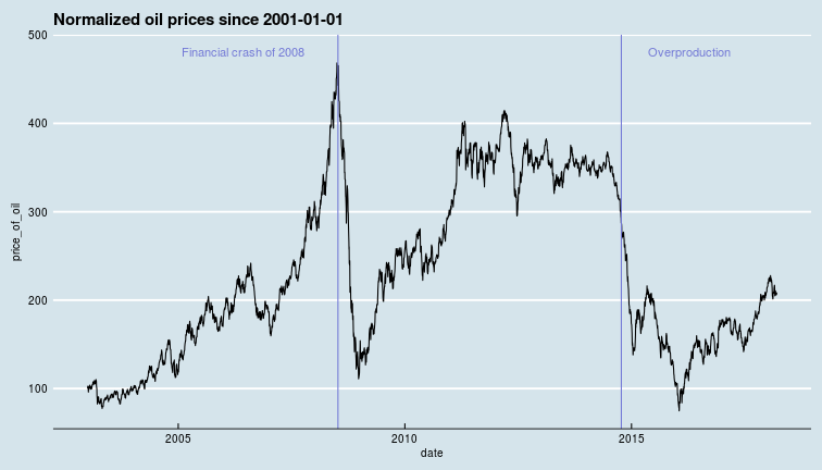
In this data, there are two major crashes the first corresponding to the financial crisis of 2008 (NYT comment on oil prices around this time) which led to lower demand, while the oil price crash of 2014-15 seems to be linked to over production as oil producers competed for market share despite production ramp-ups in North America with fracking in the USA and oil sands in Canada.
Correlations in time
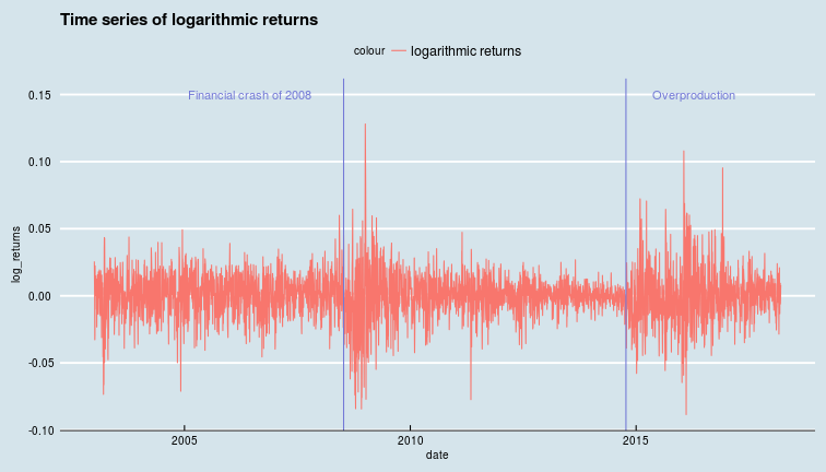
Is this a random walk ? The random walk hypothesis follows intuitively from the efficient market hypothesis. If today's price includes all available information then it is the best available estimate of tomorrow's price, i.e., the price could go either way tomorrow, and successive returns are un-correlated. However, We see from the oil price chart above that there are long periods of positive and negative returns. At least at some times, over short-ish time scales, returns do seem to be correlated.
Another useful concept about any time series \(\{y_t\}\) is stationarity. A time series is said to be stationary if it's mean function \(\mu_t = E[y_t]\) and it's autocovariance function \(\gamma(t,t-k) = E[(y_t-\mu_t)(y_{t-k}-\mu_{t-k})]\) are both independent of time. In other words, a series is stationary if, over time, all its values are distributed around the same mean, and its relationship with its past does not evolve over time. A strongly stationary process has a joint probability distribution which does not change when shifted in time, i.e. ALL moments of the distribution are time independent.
In practice, most financial time series are not stationary, however, stationary series can often be derived from non stationary series. For instance, the differences, or returns on a time series could be stationary even if the series itself is not. Or, the series could be fit to a function that approximates its mean over time, and subtracting this fitted mean from the original series yields a stationary series. As we shall see in subsequent sections, the simplest models often assume that a series is stationary.
We can measure the influence of the past on the present value of a time series via its autocorrelation function. The autocorrelation of a signal is the correlation of a signal with a delayed copy of itself. The autocorrelation function (ACF) calculates the correlations with different lags, giving us some idea about how long it takes for information contained in today's price to be swamped by new information in the signal.
The autocorrelation is just the normalized autocovariance function. Given observations \(y_t\) for \(t\in \{1..N\}\), the autocorrelation for lag \(k\) is given by,
and stationarity would imply \(\mu_{t-k}=\mu_t \text{ }\forall (t,k)\). The ACF computes this number for various values of \(k\). In practice, we use the (slightly more complicated) partial autocorrelation function that computes the correlation of a time series with a lagged version of itself like the ACF, but also controls for the influence of all shorter lags. In other words, for a lag of say, 2 days, it computes how much the price day before yesterday is correlated with the price today (over the whole time series) over and above the correlation induced by the price yesterday (which is correlated to today's as well as day before yesterday's price). This gives a "decoupled" version of the influence of various time points in the past on the present.
oil_price_returns <- data_frame(date = oil_prices$date[2:nrow(oil_prices)],
                                returns = diff(oil_prices$price_of_oil),
                                log_returns = diff(log(oil_prices$price_of_oil)))

ggplot(oil_price_returns) +
  geom_line(aes(x = date, y = log_returns,
                colour = "logarithmic returns")) +
  ggtitle("Time series of logarithmic returns") +
  ggthemes::theme_economist() +
  geom_vline(xintercept = as.Date("2008-07-11"),
             colour = "#7379d6") +
  annotate(geom = "text", label = "Financial crash of 2008",
           x = as.Date("2006-6-11"), y = 0.15,
           colour = "#7379d6") +
  geom_vline(xintercept = as.Date("2014-10-11"), colour = "#7379d6") +
  annotate(geom = "text", label = "Overproduction",
           x = as.Date("2016-4-11"), y = 0.15,
           colour = "#7379d6")
temp_acf_log_returns <- pacf(oil_price_returns$log_returns,
                             lag.max = 8, plot = FALSE)
acf_df <- data_frame(log_returns_acf = temp_acf_log_returns$acf[, ,1],
                     lag = temp_acf_log_returns$lag[, ,1])
ggplot(data = acf_df) +
  geom_point(aes(x = lag, y = log_returns_acf)) +
  geom_segment(aes(x = lag, y = log_returns_acf,
                   xend = lag, yend = 0)) +
  geom_hline(aes(yintercept = 0)) +
  ggtitle("Partial autocorrelation function for the logarithmic returns") +
  ggthemes::theme_economist()
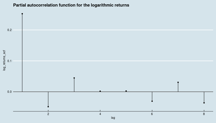 In general then, the price of oil today is correlated with the price of oil yesterday, but, it would seem, has basically nothing to do with the price of oil the day before.
While this is true of the whole time series, we could also compute this for windows of 365 days each (short windows lead to noisy estimates of the ACF coefficients), to see if there are periods of high long-range (multiple day) correlations.
acf_noplot <- function(vector){
    return(pacf(vector, lag.max = 8, pl = FALSE))
}
window_width <- 365
windowed_acf <- rollapply(oil_price_returns$log_returns,
                          width = window_width,
                          FUN = acf_noplot,
                          align = "left") %>% unlist()

windowed_acf_df <- windowed_acf  %>%
  matrix(8, length(windowed_acf)/8) %>%
  t() %>%
  as_data_frame() %>%
  slice(1:(nrow(oil_price_returns)-window_width+1)) %>%
  mutate_all(as.numeric) %>%
  mutate(date = oil_price_returns$date[window_width:nrow(oil_price_returns)])

acf_values <- windowed_acf_df %>%
  summarise_all(mean) %>%
  gather()

acf_values %>% head()
## # A tibble: 6 x 2
##   key      value
##   <chr>    <dbl>
## 1 V1     0.245
## 2 V2    -0.0536
## 3 V3     0.0213
## 4 V4     0.00316
## 5 V5     0.0104
## 6 V6    -0.0128
We can see that while evaluating ACFs on smaller samples via a moving window and taking the mean is not quite the same as taking the ACF on the whole series, the pattern is not different, i.e., the correlation is washed out after the second day.
Now, we can plot the 2nd, 3rd and 4th terms of the ACF function to see if there are periods of higher and lower correlations in the oil prices.
ggplot(windowed_acf_df) +
  geom_line(aes(x = date, y = V1, colour = "Lag 1")) +
  geom_line(aes(x = date, y = V2, colour = "Lag 2")) +
  geom_line(aes(x = date, y = V3, colour = "Lag 3")) +
  geom_vline(xintercept = as.Date("2008-07-11"),
             colour = "#7379d6") +
  annotate(geom = "text", label = "Financial crash of 2008",
           x = as.Date("2006-6-11"), y = 0.5,
           colour = "#7379d6") +
  geom_vline(xintercept = as.Date("2014-10-11"),
             colour = "#7379d6") +
  annotate(geom = "text", label = "Overproduction",
           x = as.Date("2016-4-11"), y = 0.5,
           colour = "#7379d6") +
  geom_line(aes(x = oil_prices$date[window_width:(nrow(oil_prices)-1)],
                y = oil_prices$price_of_oil[window_width:(nrow(oil_prices)-1)]/1000,
                colour = "rescaled oil price"), alpha = 0.55) +
  ggthemes::theme_economist() +
  ggtitle("Evolution of correlations with different lags") +
  ylab("correlation")
 It is clear by inspection that both crashes correspond to increasing correlation (of log-returns) across all three lag terms plotted. That is, while the oil price was crashing, autocorrelations (of log-returns) with lags of 1, 2, 3 days were all increasing. autocorrelations peaked when the oil price reached rock bottom and relaxed again as the price recovery started.
The time series of log-returns on oil prices is clearly not stationary (and nor are oil prices themselves, needless to say). So, what is a good way to forecast oil prices ?
\(AR(p)\), \(ARMA(p,q)\), \(ARIMA(p,d,q)\), \(ARCH(q)\), \(GARCH(p,q)\) ...
One possible simple model of a time series like ours is an autoregressive process of order \(p\). This just means that the current value of the time series depends on the value of the time series at \(p\) previous time steps and a noise term. An \(AR(p)\) process (this is what they are called..) take the form,
where \(\epsilon_t\) is the uncorrelated, unbiased noise term. For oil price returns, the coefficients \(\phi_i\) will probably not be significant (overall) for \(i>1\). However, we have already seen that the influence of the past changes with time, and there are periods when multiple day correlations might be vital to explaining the change in price. \(AR(p)\) processes need not always be stationary. Moving average models \(MA(q)\) on the other hand are always stationary and posit that the present value \(y_t\) is the sum of some mean value, a white noise term, and a sum over \(q\) past values of noise terms (the moving average referred to in the name).
It does not take a genius to infer that autoregressive moving average \(ARMA(p,q)\) models consist of \(p\) auto regressive and \(q\) moving average terms. They are weakly stationary (the first two moments are time invariant).
To be able to forecast non-stationary processes, \(ARMA(p,q)\) models have been generalized to autoregressive integrated moving average \(ARIMA(p,d,q)\) models. Apart from the \(p\) lagged values of itself and the sum over \(q\) noise terms from the past the \(ARIMA(p,d,q)\) also have the time series values differenced \(d\) times. This differencing is the discrete version of a derivative, so 1st order differencing is \(y_t' = y_t - y_{t-1}\) while second order differencing is \(y_t'' = y'_t - y'_{t-1} = (y_t - y_{t-1}) - (y_{t-1} - y_{t-2})\) and so on.
So far, we have seen schemes add successive levels of complexity to model the value of a time series, but none of these attempt to model the changes over time of the noise terms. So far, these schemes have assumed the parameters of the noise term to be constants. The autoregressive conditional heteroskedasticity \(ARCH(q)\) and it's cousin the generalized autoregressive conditional heteroskedasticity \(GARCH(p,q)\) do model the evolution of the noise term over time. In particular, \(ARCH(q)\) models assume an autoregression of order \(q\), an \(AR(q)\) model for the variance of the noise term, while \(GARCH(p,q)\) models assume an \(ARIMA(p,q)\) model for the variance of the noise term. Thus, one might use a \(ARIMA(p,d,q)\) process to model the price of oil, and a \(GARCH(r,s)\) process to model its volatility (the variance of the noise term !). Now, we will attempt to forecast oil prices using a \(ARIMA(2,2,2)\) process. We will fit the process to data until 2018-01-01, and calculate the RMS error on log-returns data post 2015-01-01.
test_date <- "2017-05-01"
train <- oil_prices$price_of_oil[oil_prices$date<=as.Date(test_date)]
test <- oil_prices$price_of_oil[oil_prices$date>as.Date(test_date)]

arima_fit <- arima(train, order = c(3,1,3), transform.pars = TRUE,
                   seasonal=list(order=c(1,0,1), period=20))
simulated_prices <- predict(arima_fit,length(test))
test_df <- data_frame(date = oil_prices$date,
                      price_of_oil = oil_prices$price_of_oil,
                      arima_prediction = c(train,simulated_prices$pred),
                      arima_error = c(seq(0,0,length.out = length(train)),
                                      simulated_prices$se))
ggplot(test_df) +
  geom_line(aes(x = date, y = arima_prediction, colour = "arima pred")) +
  geom_errorbar(aes(x = date,
                    ymin = arima_prediction-arima_error,
                    ymax = arima_prediction+arima_error,
                    colour = "arima pred"), alpha = 0.07) +
  geom_line(aes(x = date, y = price_of_oil,
                colour = "price of oil")) +
  ggthemes::theme_economist() +
  xlim(as.Date("2015-08-01"), as.Date("2018-03-25")) +
  ylim(20,350) +
  ggtitle("Arima predictions")
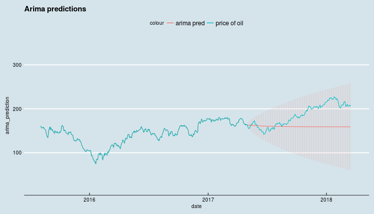
Clearly, not a great forecast even during a period without extreme price movements. We will round off our little discussion of univariate financial time series with a small section on how returns are distributed.
Distribution of returns
With all the talk around random walks on wall street, and with Gaussian distributions being analytically tractable, people - including experts - have come to rely on too many distributions in finance being Gaussian, and they are not. There is a rather good reason for random walks leading to Gaussian distributions : the central limit theorem. The basic idea is, for a large class of probability distributions (i.e. those whose variances are finite) if one adds a large number of independent random variables (eg. steps in a random walk... the position after a large number of steps is the sum of each step) one gets a number that has a Gaussian distribution.
However, these conditions are not always fulfilled. We have already seen that each step (the returns) in the random walk (of the price) is not always independent of the others (see the autocorrelations in the returns discussed above), and even worse, the returns may or may not have a distribution that is nice and has a finite variance.
Let us take a look at the distribution of scaled logarithmic returns of oil prices as compared to the normal (Gaussian) distribution via quantile-quantile plots.
ggplot(oil_price_returns) +
    geom_qq(aes(sample = scale(log_returns), colour = "log-returns"),
            distribution = stats::qnorm) +
    ggtitle("Quantile-quantile plot of log-returns against normal distribution") +
    ggthemes::theme_economist()
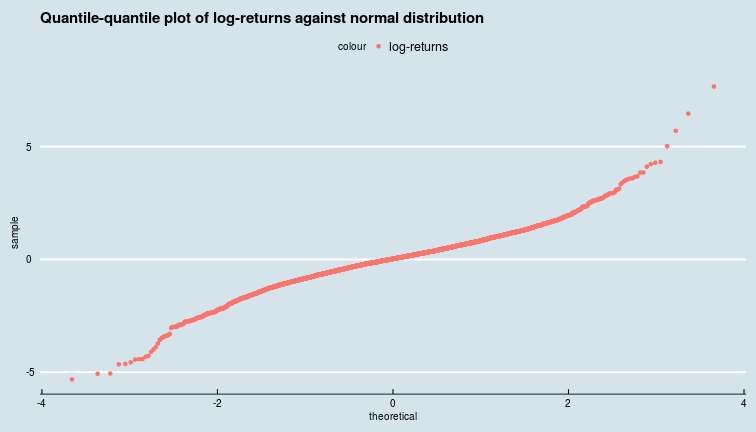 Clearly, both returns and logarithmic returns take large positive and negative values far more frequently than they would if they indeed followed a Gaussian distribution. This tells us that the distributions of returns (and log-returns) of oil prices have fatter tails.
We can try to fit these to a distribution with a fatter tail, like the Cauchy distribution, and plot the densities on a semi-log plot so that we see the tails better.
cauchy_fit <- fitdistr(scale(oil_price_returns$returns), densfun = "cauchy")
glue("Location parameter is {cauchy_fit$estimate[1]} and the scale parameter is {cauchy_fit$estimate[2]}")
## Location parameter is 0.0347862087434961 and the scale parameter is 0.497758531292875
ggplot(oil_price_returns) +
  geom_point(aes(x = scale(oil_price_returns$log_returns),
                 colour = "log returns", y = ..density..), stat = "bin") +
  stat_function(fun = dcauchy, n = 1e2, args = list(location = cauchy_fit$estimate[1],
                                                    scale = cauchy_fit$estimate[2]),
                size = 1, alpha = 0.8, aes(colour = "cauchy")) +
  stat_function(fun = dnorm, n = 1e2,
                args = list(mean = mean(scale(oil_price_returns$log_returns)),
                            sd = sd(scale(oil_price_returns$log_returns))),
                size = 1, alpha = 0.8, aes(colour = "gaussian"), xlim = c(-4,4)) +
  scale_y_log10() +
  ggtitle("Distribution of logarithmic returns") +
  ggthemes::theme_economist() +
  xlab("Scaled logarithmic returns")
## `stat_bin()` using `bins = 30`. Pick better value with `binwidth`.
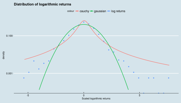 We see that the distribution of logarithmic returns has fatter tails than the Gaussian, but is not quite as fat tailed as the Cauchy distribution.
The central limit theorem is only one of a class of limit theorems, and the Gaussian is only one attractor of an infinite set of attractors in the space of probability distributions. When assumptions about independence and existence of second moments that lead to the CLT fail, we should examine other limit distributions that may lead to behavior that is qualitatively different from that of a pleasant Gaussian random walk. But, that is a story for a later blog post :)