 p. bhogale
 Companion to "Interrogating Your Twin: Causal Reasoning in Manufacturing Systems" given at Fifth Elephant 2026, Pune Edition, (pdf slides). Earlier posts in this series:
- Climbing Pearl's Ladder of Causation --- the conceptual foundations
- A causal workflow with coupon marketing data --- the five-step pipeline applied to marketing
- This post --- real factory data, reverse causation, and the full pipeline
This is the companion walkthrough for the talk Interrogating Your Twin: Causal Reasoning in Manufacturing Systems (Fifth Elephant 2026, Pune). The talk introduces Pearl's Ladder of Causation and argues that predictive maintenance needs to move beyond pattern-matching (Rung 1) to interventional reasoning (Rung 2). Here we do exactly that, with real-ish production data from a manufacturing facility.
The workflow:
- DAG --- encode domain knowledge as a directed acyclic graph
- Test --- check the DAG's implied independencies against data
- Identify --- use the backdoor criterion (and
dosearch) to find the right adjustment set - Estimate --- obtain causal coefficients with proper adjustment
We also extend the pipeline in two directions the talk previews: structure learning (can the data discover the DAG?) and causal ML (heterogeneous treatment effects via grf::causal_forest, with targeted intervention recommendations). Along the way we encounter reverse causation, collider bias, and a demonstration of what goes wrong when you "control for everything."
Three tables from a real factory's monitoring system, covering 47 days of production across ~23 machines running two 12-hour shifts:
Assembling the analysis dataset
The analysis unit is a machine-shift: one machine \(\times\) one 12-hour shift. For each, we compute whether a breakdown occurred, how long the machine ran, its mean energy draw, and how many process changeovers happened.
Sparse events --- about 3% of machine-shifts end in a breakdown. Each missed one is expensive: unplanned downtime, emergency repair, cascading delays. This asymmetry --- cheap inspections, expensive failures --- is the economic foundation of everything that follows.
Rung 1: what does the data show?
Before building any causal model, let's look at what simple associations exist. With a ~3% event rate, density plots are useless --- the breakdown distribution drowns in the normal mass. Instead, we compute breakdown rates within bins and plot those directly with confidence intervals.
Breakdown rate by shift
df |>
  group_by(shift) |>
  summarise(
    n         = n(),
    failures  = sum(breakdown),
    rate      = mean(breakdown),
    se        = sqrt(rate * (1 - rate) / n),
    .groups   = "drop"
  ) |>
  ggplot(aes(x = shift, y = rate)) +
  geom_point(size = 3, colour = col_fail) +
  geom_errorbar(aes(ymin = rate - 1.96 * se, ymax = rate + 1.96 * se),
                width = 0.12, colour = col_fail) +
  geom_rangeframe(sides = "l") +
  scale_y_continuous(labels = scales::percent_format()) +
  labs(title = "Breakdown rate by shift",
       x = NULL, y = "Breakdown rate")
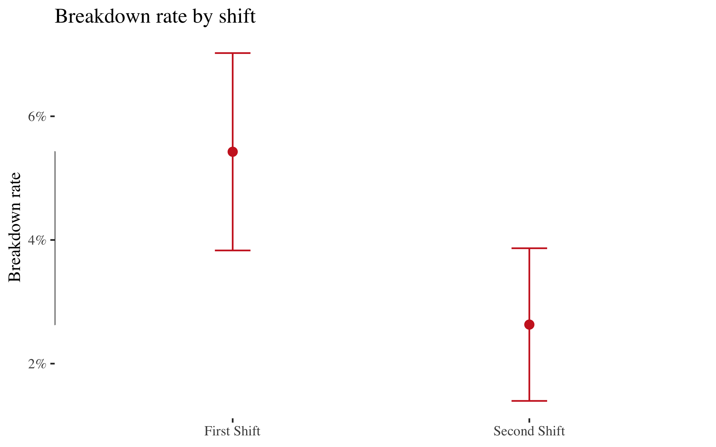
First Shift breaks down roughly twice as often as Second Shift. That's a real signal --- but is it causal?
Breakdown rate by running hours
df |>
  mutate(run_bin = cut(run_hours, breaks = c(0, 3, 6, 9, 12),
                       include.lowest = TRUE)) |>
  group_by(run_bin) |>
  summarise(
    n    = n(),
    rate = mean(breakdown),
    se   = sqrt(rate * (1 - rate) / n),
    mid  = mean(run_hours),
    .groups = "drop"
  ) |>
  ggplot(aes(x = mid, y = rate)) +
  geom_point(size = 3, colour = col_fail) +
  geom_errorbar(aes(ymin = pmax(rate - 1.96 * se, 0),
                    ymax = rate + 1.96 * se),
                width = 0.3, colour = col_fail) +
  geom_rangeframe(sides = "bl") +
  scale_y_continuous(labels = scales::percent_format()) +
  labs(title = "Breakdown rate by running hours in shift",
       subtitle = "Short runs have HIGH failure rates --- but why?",
       x = "Running hours in shift", y = "Breakdown rate")
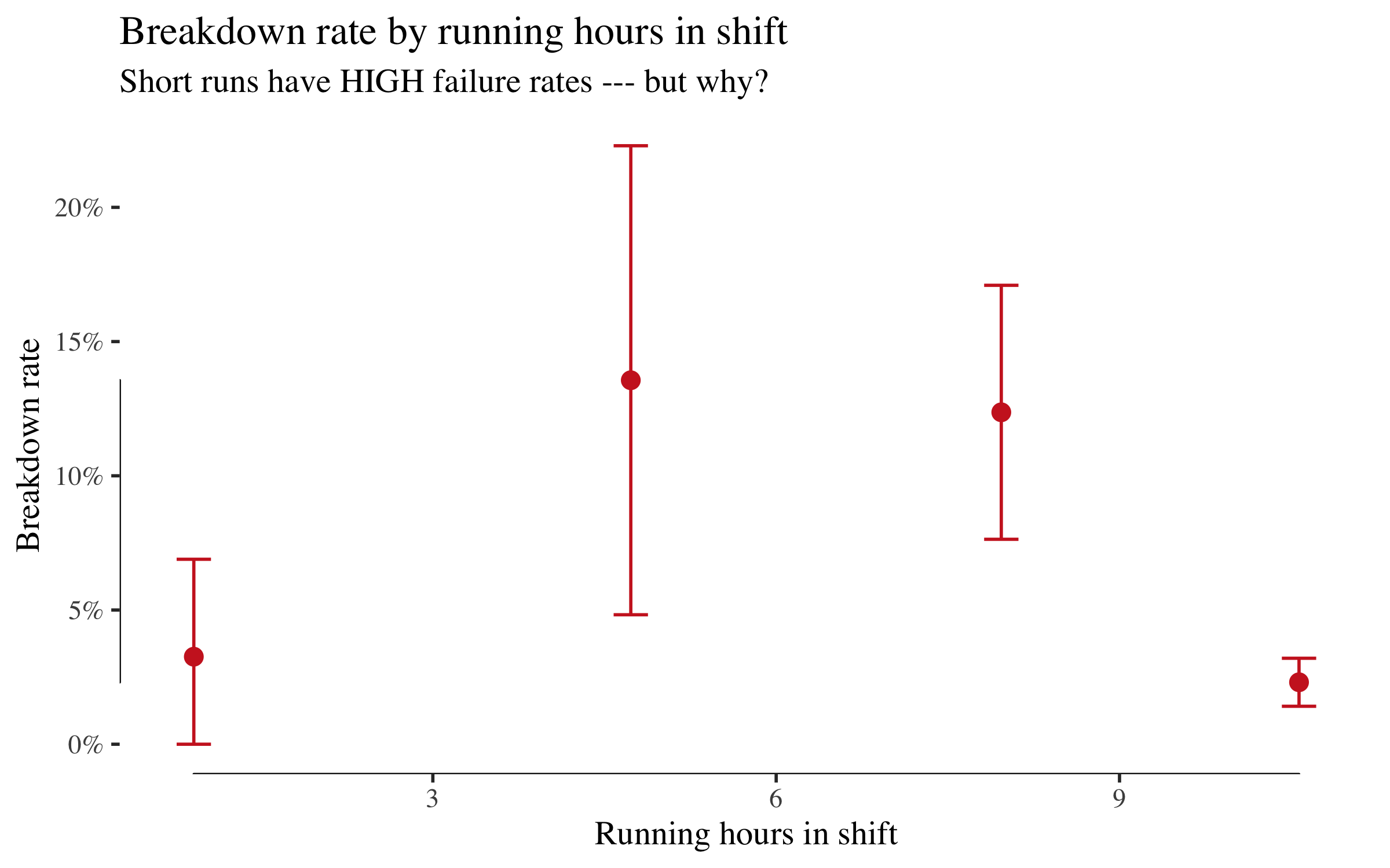
This is striking and counterintuitive. Machines that ran for only 0--3 hours have a ~10% breakdown rate, while those that ran 11+ hours have under 1%. A naive analyst might conclude that running a machine longer prevents breakdowns. That conclusion is backwards.
This is reverse causation. Breakdowns truncate shifts --- a machine that breaks down after two hours gets recorded as a short run. The arrow runs from breakdown to run_hours, not the other way round. This is exactly the trap the DAG will help us avoid.
Breakdown rate by changeovers
df |>
  mutate(co_label = case_when(
    n_changeovers == 0 ~ "0",
    n_changeovers == 1 ~ "1",
    TRUE               ~ "2+"
  )) |>
  group_by(co_label) |>
  summarise(
    n    = n(),
    rate = mean(breakdown),
    se   = sqrt(rate * (1 - rate) / n),
    .groups = "drop"
  ) |>
  ggplot(aes(x = co_label, y = rate)) +
  geom_point(size = 3, colour = col_fail) +
  geom_errorbar(aes(ymin = pmax(rate - 1.96 * se, 0),
                    ymax = rate + 1.96 * se),
                width = 0.12, colour = col_fail) +
  geom_rangeframe(sides = "l") +
  scale_y_continuous(labels = scales::percent_format()) +
  labs(title = "Breakdown rate by number of changeovers",
       subtitle = "Changeovers associate with higher breakdown risk",
       x = "Changeovers in shift", y = "Breakdown rate")
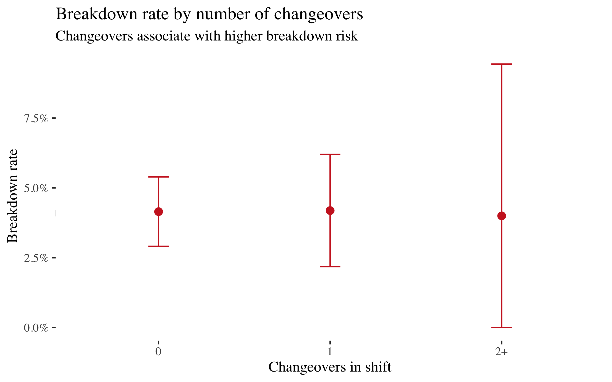
Shifts with one or more changeovers have roughly double the breakdown rate of shifts with none. The mechanism is plausible: each tool or process changeover stresses the machine, increases setup risk, and creates a window for operator error. We'll test whether this survives causal adjustment.
Note that First Shift also has more changeovers (mean 0.31 vs 0.21). That means changeovers might mediate part of the shift effect. The DAG will make this explicit.
Breakdown rate by energy
df |>
  mutate(energy_bin = cut(mean_energy, breaks = 5)) |>
  group_by(energy_bin) |>
  summarise(
    n    = n(),
    rate = mean(breakdown),
    se   = sqrt(rate * (1 - rate) / n),
    mid  = mean(mean_energy),
    .groups = "drop"
  ) |>
  drop_na() |>
  ggplot(aes(x = mid, y = rate)) +
  geom_point(size = 3, colour = col_fail) +
  geom_errorbar(aes(ymin = pmax(rate - 1.96 * se, 0),
                    ymax = rate + 1.96 * se),
                width = 0.01, colour = col_fail) +
  geom_rangeframe(sides = "bl") +
  scale_y_continuous(labels = scales::percent_format()) +
  labs(title = "Breakdown rate by mean energy consumption",
       subtitle = "No causal relationship --- but energy is not independent of everything",
       x = "Mean energy per 5-min reading (kWh)", y = "Breakdown rate")
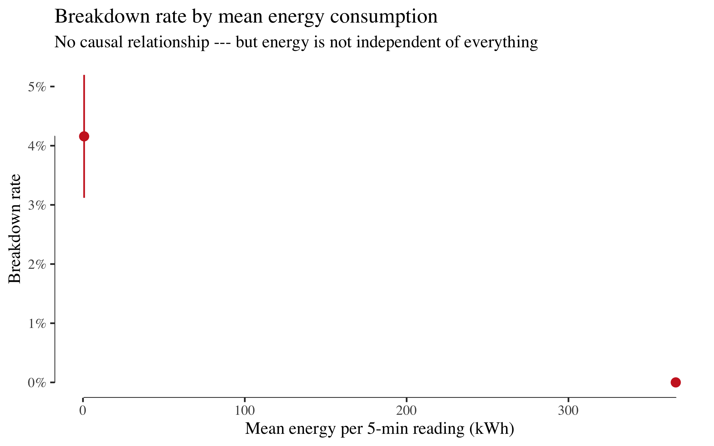
Energy consumption shows no meaningful pattern with breakdowns. It has no business in a causal model of failure. But keep this in mind for the next section because the structure learning algorithm disagrees.
Structure learning: can the data discover the DAG?
Before imposing our domain knowledge, let's ask: what does the data alone suggest about the causal structure? We use bnlearn's hill-climbing algorithm with the BIC-CG score (appropriate for mixed continuous/discrete data) to learn a Bayesian network.
df_bn <- df |>
  transmute(
    shift     = shift_f,
    mg        = machine_group,
    run_hours = run_hours,
    energy    = mean_energy,
    changeovers = as.numeric(n_changeovers),
    breakdown = factor(breakdown)
  )

set.seed(42)
learned_dag <- hc(df_bn, score = "bic-cg")

par(mar = c(1, 1, 2, 1))
graphviz.plot(learned_dag,
              main   = "Data-learned structure (bnlearn hill-climbing)",
              shape  = "ellipse")
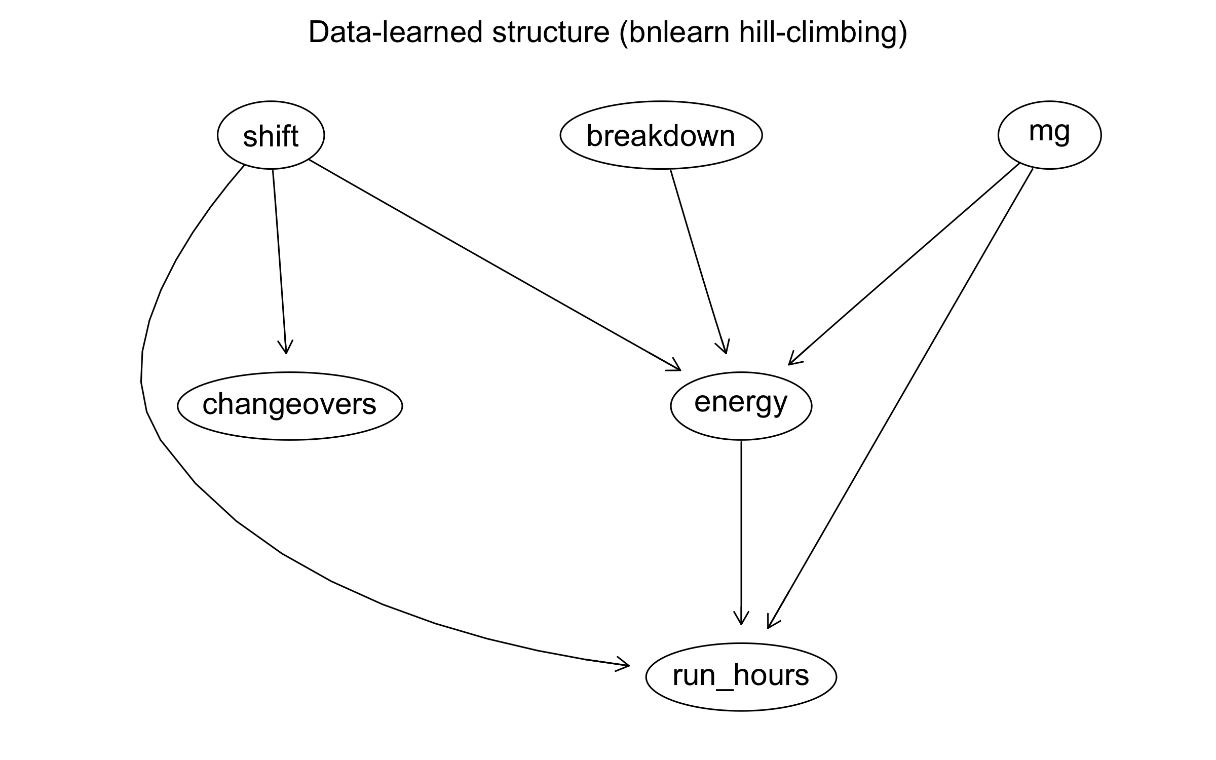
arcs(learned_dag) |> as_tibble()
## # A tibble: 7 × 2
##   from      to
##   <chr>     <chr>
## 1 mg        energy
## 2 shift     energy
## 3 shift     changeovers
## 4 shift     run_hours
## 5 mg        run_hours
## 6 breakdown energy
## 7 energy    run_hours
Look at what the algorithm found:
-
Energy appears as a hub --- connected to machine group, shift, breakdown, and run_hours. The data correctly identifies that energy is associated with many variables. But we showed above that it has no effect on breakdown. Why is it so central? Because energy is a common descendant: bigger machines (machine group) draw more power, and breakdowns change how energy is averaged over the shift.
bnlearnfinds associations at Rung 1; it cannot distinguish "energy is caused by these variables" from "energy causes these variables." A variable with zero causal relevance to the outcome can appear highly connected in a learned graph. -
Run_hours and breakdown are connected --- but the algorithm may orient the edge as
run_hours -> breakdown(the naive, wrong direction). The data can't tell you it's actually reverse causation. -
Shift and changeovers likely appear connected --- consistent with First Shift having more changeovers.
This is the lesson: data discovers edges; domain knowledge orients them. Structure learning is Rung 1. It finds statistical dependencies. It cannot distinguish run_hours -> breakdown from breakdown -> run_hours because both produce the same joint distribution. For that, you need the mechanism, which is Rung 2.
The DAG: what causes breakdowns?
The learned graph gives us a starting point, but we need to make three corrections that only domain knowledge can supply:
-
Reverse the
run_hours -- breakdownedge. The algorithm sees a strong association but can't tell which way it runs. We know the mechanism: breakdowns truncate shifts. A machine that fails after two hours logs a short run. The arrow isbreakdown -> run_hours, not the other way round. This is the reverse causation we spotted in the rate plot. -
Remove energy. It appears as a hub in the learned graph because it's a common descendant --- machine group and breakdown both influence how energy averages out over a shift. It has zero causal relevance to failure. Keeping it would add spurious paths and complicate adjustment sets for no gain.
-
Orient the mediator path. The algorithm finds that shift, changeovers, and breakdown are all connected, but doesn't know that the mechanism is shift -> changeovers -> breakdown (First Shift schedules more changeovers, each of which stresses the machine). This matters because it determines whether we should adjust for changeovers when estimating the shift effect (answer: only if we want the direct effect, not the total).
With those corrections, we write down the DAG:
factory_dag <- dagitty('dag {
  machine_group [pos="0,0"]
  shift         [pos="2,0"]
  changeovers   [pos="1,1"]
  breakdown     [pos="1,2"]
  run_hours     [pos="1,3"]

  machine_group -> breakdown
  machine_group -> changeovers
  shift         -> breakdown
  shift         -> changeovers
  changeovers   -> breakdown
  breakdown     -> run_hours
}')

plot(factory_dag)
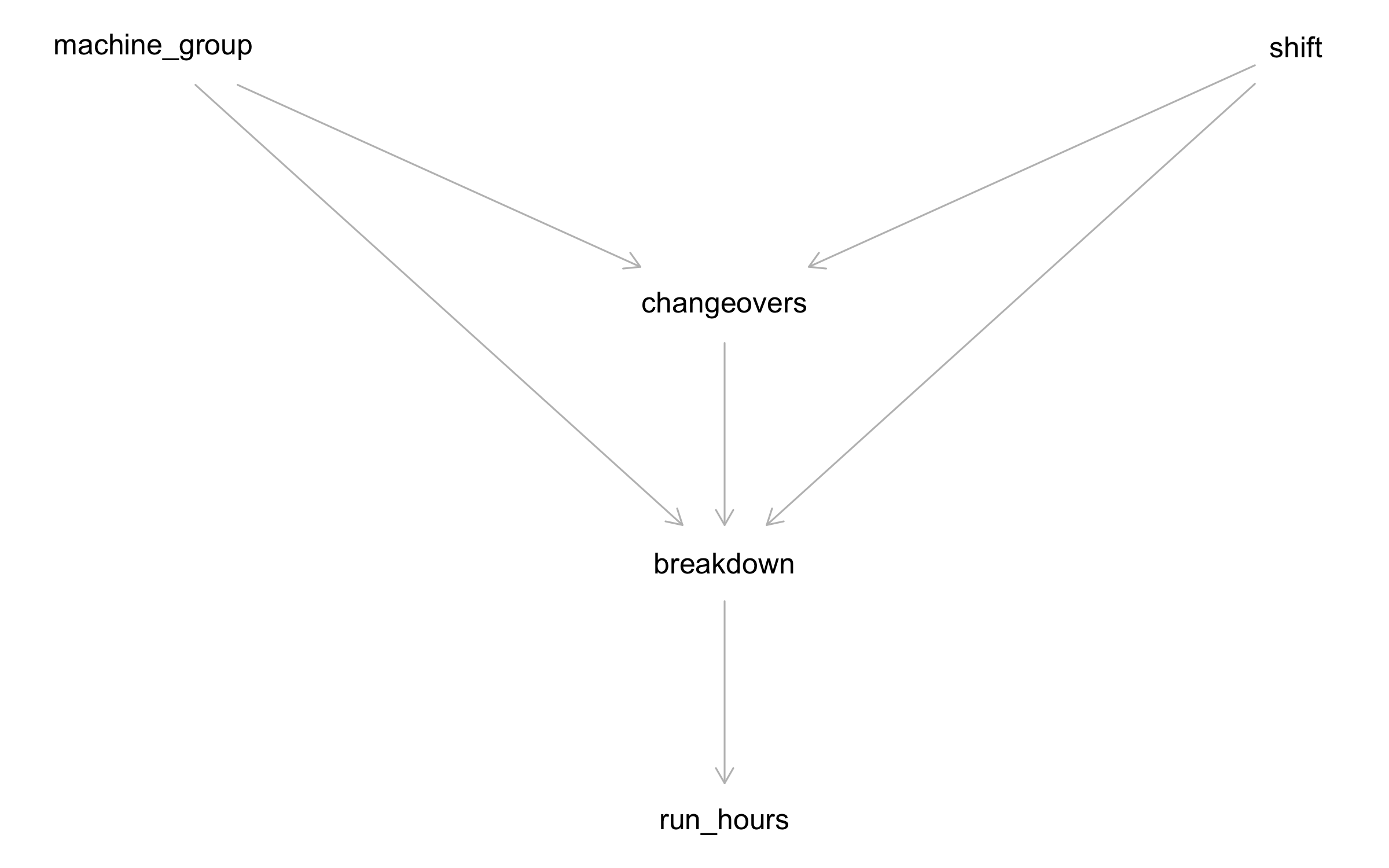
Note:
-
Changeovers is a mediator. Part of the shift effect on breakdown flows through changeovers (shift -> changeovers -> breakdown). The rest is the direct shift effect. This distinction matters for intervention: if you can reduce changeovers, you block the mediated path. If you can't, the direct effect tells you what's left.
-
Run_hours is a descendant of breakdown, not a cause. Including it in a regression would condition on a collider descendant --- introducing bias. The DAG tells us to leave it out.
-
Machine group is a common cause of changeovers and breakdown --- but it does not cause shift assignment. That means it is not a confounder of the total shift→breakdown effect. However, when we estimate the direct effect (blocking the mediated path through changeovers), conditioning on changeovers opens the path shift → changeovers ← machine_group → breakdown, so we must adjust for machine_group as well. This distinction --- irrelevant for the total effect, essential for the direct effect --- is exactly the kind of reasoning the DAG makes explicit.
Testing the DAG
A DAG implies conditional independencies that the data can falsify.
impliedConditionalIndependencies(factory_dag)
## chng _||_ rn_h | brkd
## mch_ _||_ rn_h | brkd
## mch_ _||_ shft
## rn_h _||_ shft | brkd
df_for_dag <- df |>
  mutate(
    shift_num = as.integer(shift == "Second Shift"),
    mg_num    = as.integer(machine_group)
  ) |>
  select(mg_num, run_hours, shift_num, breakdown, n_changeovers) |>
  rename(machine_group = mg_num, shift = shift_num,
         changeovers = n_changeovers)

test_dag <- dagitty('dag {
  machine_group -> breakdown
  machine_group -> changeovers
  shift         -> breakdown
  shift         -> changeovers
  changeovers   -> breakdown
  breakdown     -> run_hours
}')

localTests(test_dag, data = df_for_dag, type = "cis") |>
  as_tibble(rownames = "test") |>
  arrange(p.value) |>
  mutate(verdict = if_else(p.value < 0.05, "VIOLATED", "ok"))
## # A tibble: 4 × 6
##   test                  estimate p.value  `2.5%` `97.5%` verdict
##   <chr>                    <dbl>   <dbl>   <dbl>   <dbl> <chr>
## 1 mch_ _||_ rn_h | brkd -0.0706  0.00782 -0.122  -0.0186 VIOLATED
## 2 chng _||_ rn_h | brkd -0.0317  0.232   -0.0836  0.0203 ok
## 3 mch_ _||_ shft         0.0103  0.699   -0.0418  0.0622 ok
## 4 rn_h _||_ shft | brkd -0.00754 0.777   -0.0596  0.0445 ok
Large \(p\)-values mean the data are consistent with the DAG's predictions. Small \(p\)-values flag implied independencies that the data violates --- a signal that an edge may be missing. If you see one marginal violation among several tests, it merits a note but not necessarily a DAG revision: with multiple tests at \(\alpha = 0.05\), one borderline rejection is expected by chance. If many tests fail, or one fails dramatically, the DAG needs work. We're looking for blatant contradictions, not hairline significance.
What the DAG says not to condition on
The DAG makes two important negative claims:
-
Do not condition on
run_hourswhen estimatingshift -> breakdown. Run hours is a descendant of breakdown. Conditioning on it opens a spurious path and biases the estimate. -
Do not condition on
changeoversif you want the total effect of shift. Changeovers is a mediator. Conditioning on it blocks the mediated path and gives you only the direct effect --- which underestimates the full impact of a shift change.
These are the mistakes a naive analyst would make by "controlling for everything available." The DAG prevents them.
Total effect vs. direct effect
This DAG gives us two distinct causal questions, with very different adjustment sets:
-
Total effect of shift: What happens to breakdown rates if we reassign machines from First to Second Shift? (Includes any change in changeovers that follows.) Because nothing in the DAG causes shift --- it is exogenous --- there are no backdoor paths to block. Adjustment set: {} (empty).
-
Direct effect of shift: What happens if we change the shift but somehow keep changeovers fixed? Now we must condition on the mediator (changeovers) to block the indirect path. But conditioning on changeovers opens a new path via the shared cause machine_group (shift → changeovers ← machine_group → breakdown), so we must also adjust for machine_group. Adjustment set: {changeovers, machine_group}.
The total effect is what the factory manager cares about for operational decisions. The direct effect tells you how much of the shift effect would remain even if you equalised changeover rates across shifts --- and it is the more interesting statistical problem, because its non-trivial adjustment set demonstrates exactly why the DAG matters.
Rung 2: from association to intervention
The causal question
Does shift assignment directly cause different breakdown rates, or does the effect run entirely through changeovers? If the direct effect is real, the intervention is clear: staff the high-risk shift differently, adjust maintenance schedules, or investigate what First Shift does differently. If the effect is entirely mediated, then equalising changeover rates across shifts should suffice.
We need two adjustment sets --- one for each effect:
# Total effect: what is the overall shift -> breakdown effect?
adjustmentSets(factory_dag,
               exposure = "shift",
               outcome  = "breakdown",
               effect   = "total")
## {}
# Direct effect: what is the shift -> breakdown effect NOT via changeovers?
adjustmentSets(factory_dag,
               exposure = "shift",
               outcome  = "breakdown",
               effect   = "direct")
## { changeovers, machine_group }
The total effect has an empty adjustment set: shift is exogenous in this DAG (nothing causes it), so there are no backdoor paths to block. A simple comparison of First vs. Second Shift breakdown rates already gives the causal total effect.
The direct effect requires adjusting for {changeovers, machine_group}. Why both? To isolate the direct path, we must condition on the mediator (changeovers). But once we do, we open the path shift → changeovers ← machine_group → breakdown --- because changeovers is now a collider on that path. Conditioning on machine_group closes it again. This is exactly the kind of reasoning the DAG encodes and the analyst wouldn't spot from a correlation matrix.
As a sanity check, let's verify that shift and machine group are independent (i.e. machines aren't systematically assigned to shifts):
chisq.test(table(df$shift, df$machine_group))
##
##  Pearson's Chi-squared test
##
## data:  table(df$shift, df$machine_group)
## X-squared = 0.16082, df = 2, p-value = 0.9227
The \(\chi^2\) test is non-significant --- shift assignment is independent of machine group in this factory. This confirms the DAG's assumption that machine_group does not cause shift, and reassures us that the total-effect adjustment set really is empty.
Algorithmic verification with dosearch
# dosearch requires single-letter nodes:
# G = machine_group, S = shift, Y = breakdown,
# C = changeovers, R = run_hours

ds_dag <- dagitty('dag {
  G -> Y
  G -> C
  S -> Y
  S -> C
  C -> Y
  Y -> R
}')

dosearch(
  data  = "P(G, S, Y, C, R)",
  query = "P(Y | do(S))",
  graph = ds_dag
)
## p(Y|S)
dosearch confirms: the interventional distribution \(P(\text{breakdown} \mid do(\text{shift}))\) is identifiable from observational data.
Estimating the causal effect
# Total effect: no adjustment needed (shift is exogenous)
m_total_minimal <- glm(breakdown ~ shift,
                       data = df, family = binomial)

# Total effect with precision covariate (machine_group improves SE, not bias)
m_total <- glm(breakdown ~ shift + machine_group,
               data = df, family = binomial)

# Direct effect: adjust for changeovers AND machine_group
m_direct <- glm(breakdown ~ shift + machine_group + n_changeovers,
                data = df, family = binomial)

bind_rows(
  broom::tidy(m_total_minimal) |> mutate(model = "Total (minimal)"),
  broom::tidy(m_total) |> mutate(model = "Total (+ machine_group for precision)"),
  broom::tidy(m_direct) |> mutate(model = "Direct (+ changeovers, machine_group)")
) |>
  filter(term != "(Intercept)") |>
  select(model, term, estimate, std.error, p.value) |>
  mutate(
    estimate  = round(estimate, 3),
    std.error = round(std.error, 3),
    p.value   = signif(p.value, 3)
  )
## # A tibble: 8 × 5
##   model                                 term          estimate std.error p.value
##   <chr>                                 <chr>            <dbl>     <dbl>   <dbl>
## 1 Total (minimal)                       shiftSecond …   -0.753     0.293 0.0101
## 2 Total (+ machine_group for precision) shiftSecond …   -0.749     0.293 0.0105
## 3 Total (+ machine_group for precision) machine_grou…   -0.162     0.336 0.63
## 4 Total (+ machine_group for precision) machine_grou…   -0.551     0.311 0.0771
## 5 Direct (+ changeovers, machine_group) shiftSecond …   -0.762     0.294 0.00964
## 6 Direct (+ changeovers, machine_group) machine_grou…   -0.163     0.336 0.626
## 7 Direct (+ changeovers, machine_group) machine_grou…   -0.552     0.312 0.0761
## 8 Direct (+ changeovers, machine_group) n_changeovers   -0.099     0.245 0.685
Three things to notice:
-
The two total-effect models give nearly identical shift coefficients. That's expected: machine_group doesn't confound shift (we confirmed this with the \(\chi^2\) test), so adding it doesn't change the point estimate. It does slightly reduce the standard error, because machine_group is a strong predictor of breakdown and soaks up residual variance.
-
The direct-effect model also gives a very similar shift coefficient. That means changeovers do not significantly mediate the shift effect in this dataset --- the changeover coefficient is small and non-significant. The shift effect on breakdowns is overwhelmingly direct: whatever First Shift does differently, it isn't primarily through more changeovers.
-
This is a legitimate finding, not a failure. The DAG predicted a possible mediation path; the data tells us the direct path dominates. The DAG gave us the right question to ask and the answer was informative.
The collider bias trap
Now let's demonstrate what goes wrong when you ignore the DAG and "control for everything." Watch what happens when we include run_hours:
m_bad <- glm(breakdown ~ shift + machine_group + run_hours,
             data = df, family = binomial)

coeftest(m_bad, vcov = vcovHC(m_bad, type = "HC1"))
##
## z test of coefficients:
##
##                      Estimate Std. Error z value  Pr(>|z|)
## (Intercept)         -1.140520   0.379689 -3.0038  0.002666 **
## shiftSecond Shift   -0.791308   0.304629 -2.5976  0.009387 **
## machine_groupMedium -0.197294   0.342920 -0.5753  0.565065
## machine_groupSmall  -0.635560   0.322452 -1.9710  0.048722 *
## run_hours           -0.161901   0.030043 -5.3890 7.087e-08 ***
## ---
## Signif. codes:  0 '***' 0.001 '**' 0.01 '*' 0.05 '.' 0.1 ' ' 1
bind_rows(
  broom::tidy(m_total) |> mutate(model = "Causal (total)"),
  broom::tidy(m_bad)   |> mutate(model = "Biased (+ run_hours)")
) |>
  filter(str_detect(term, "shift|run_hours")) |>
  select(model, term, estimate, std.error, p.value) |>
  mutate(
    estimate  = round(estimate, 3),
    std.error = round(std.error, 3),
    p.value   = signif(p.value, 3)
  )
## # A tibble: 3 × 5
##   model                term              estimate std.error   p.value
##   <chr>                <chr>                <dbl>     <dbl>     <dbl>
## 1 Causal (total)       shiftSecond Shift   -0.749     0.293 0.0105
## 2 Biased (+ run_hours) shiftSecond Shift   -0.791     0.297 0.00772
## 3 Biased (+ run_hours) run_hours           -0.162     0.038 0.0000211
Including run_hours --- a descendant of the outcome --- opens a collider path and distorts the shift coefficient. The coefficient on run_hours itself comes out negative (longer runs = fewer breakdowns), which sounds like running a machine longer prevents failure. That's the reverse causation speaking. The DAG caught this; a correlation matrix wouldn't.
The cost of getting the model wrong
The collider bias does something worse than just changing the shift coefficient slightly. Look at what the biased model tells you to do:
# What does each model say about predictors?
bind_rows(
  broom::tidy(m_total) |> mutate(model = "Causal (correct)"),
  broom::tidy(m_bad)   |> mutate(model = "Biased (+ run_hours)")
) |>
  filter(term != "(Intercept)") |>
  select(model, term, estimate, std.error, p.value) |>
  mutate(
    estimate  = round(estimate, 3),
    std.error = round(std.error, 3),
    p.value   = signif(p.value, 3)
  )
## # A tibble: 7 × 5
##   model                term                estimate std.error   p.value
##   <chr>                <chr>                  <dbl>     <dbl>     <dbl>
## 1 Causal (correct)     shiftSecond Shift     -0.749     0.293 0.0105
## 2 Causal (correct)     machine_groupMedium   -0.162     0.336 0.63
## 3 Causal (correct)     machine_groupSmall    -0.551     0.311 0.0771
## 4 Biased (+ run_hours) shiftSecond Shift     -0.791     0.297 0.00772
## 5 Biased (+ run_hours) machine_groupMedium   -0.197     0.339 0.561
## 6 Biased (+ run_hours) machine_groupSmall    -0.636     0.316 0.0442
## 7 Biased (+ run_hours) run_hours             -0.162     0.038 0.0000211
The biased model tells you that run_hours is the strongest predictor (large negative coefficient, tiny \(p\)-value). A naive analyst reads this as: "running machines longer prevents breakdowns --- schedule longer shifts!" That's backwards. Run hours is short because the machine broke down.
The causal model avoids this trap entirely. It tells you the right thing: shift assignment is the actionable lever, and machine group modifies the effect. The biased model finds a real statistical pattern (short runs correlate with breakdowns) but prescribes the wrong intervention.
Causal ML: from average effects to targeted intervention
Everything so far has estimated an average shift effect. But the manufacturing engineer asks a more specific question: which machine types are most affected by being on First Shift? If the shift effect varies by machine group, we should concentrate interventions --- shift reassignment, extra maintenance, operator support --- on the machines where the risk premium is largest. For that, we need heterogeneous treatment effects.
Defining the treatment
Our treatment is binary: First Shift (treatment = 1) vs. Second Shift (treatment = 0). The covariates are pre-treatment variables that might modify the treatment effect --- specifically, machine group.
We deliberately exclude energy and run_hours: energy has no causal role, and run_hours is a post-treatment descendant. The DAG tells us what belongs here.
df_cf <- df |>
  mutate(
    W = as.integer(shift == "First Shift")
  )

# Machine group dummies as covariates
mg_dummies <- model.matrix(~ machine_group - 1, data = df_cf) |>
  as_tibble()
df_cf <- bind_cols(df_cf, mg_dummies)
cov_cols <- names(mg_dummies)

X <- as.matrix(df_cf[, cov_cols])
Y <- df_cf$breakdown
W <- df_cf$W

# Treatment balance
tibble(
  shift       = c("First (W=1)", "Second (W=0)"),
  n           = c(sum(W), sum(1 - W)),
  failures    = c(sum(Y[W == 1]), sum(Y[W == 0])),
  rate        = c(mean(Y[W == 1]), mean(Y[W == 0]))
)
## # A tibble: 2 × 4
##   shift            n failures   rate
##   <chr>        <dbl>    <int>  <dbl>
## 1 First (W=1)    774       42 0.0543
## 2 Second (W=0)   646       17 0.0263
Shift assignment has natural variation --- machines appear on both shifts, and the assignment is essentially independent of machine characteristics. This gives the causal forest good overlap for CATE estimation.
Fitting the causal forest
set.seed(42)
cf <- causal_forest(X = X, Y = Y, W = W, num.trees = 2000)

ate <- average_treatment_effect(cf)
ate
##   estimate    std.err
## 0.02768711 0.01033986
The ATE tells us the average increase in breakdown probability from being on First Shift --- the same quantity the logistic regression estimated, now estimated non-parametrically. Before trusting these estimates, we check a key assumption: positivity (also called overlap). Every machine type needs to appear on both shifts often enough for the forest to compare treated and untreated observations. We check this via the estimated propensity score - the probability of being assigned to First Shift given covariates.
tibble(propensity = cf$W.hat) |>
  ggplot(aes(x = propensity)) +
  geom_histogram(bins = 30, fill = col_bar, alpha = 0.7, colour = "white") +
  geom_rangeframe(sides = "b") +
  labs(title = "Propensity score distribution",
       subtitle = "Scores near 0.5 mean both shifts are well-represented for every machine type",
       x = "Estimated P(First Shift | covariates)", y = "Count")
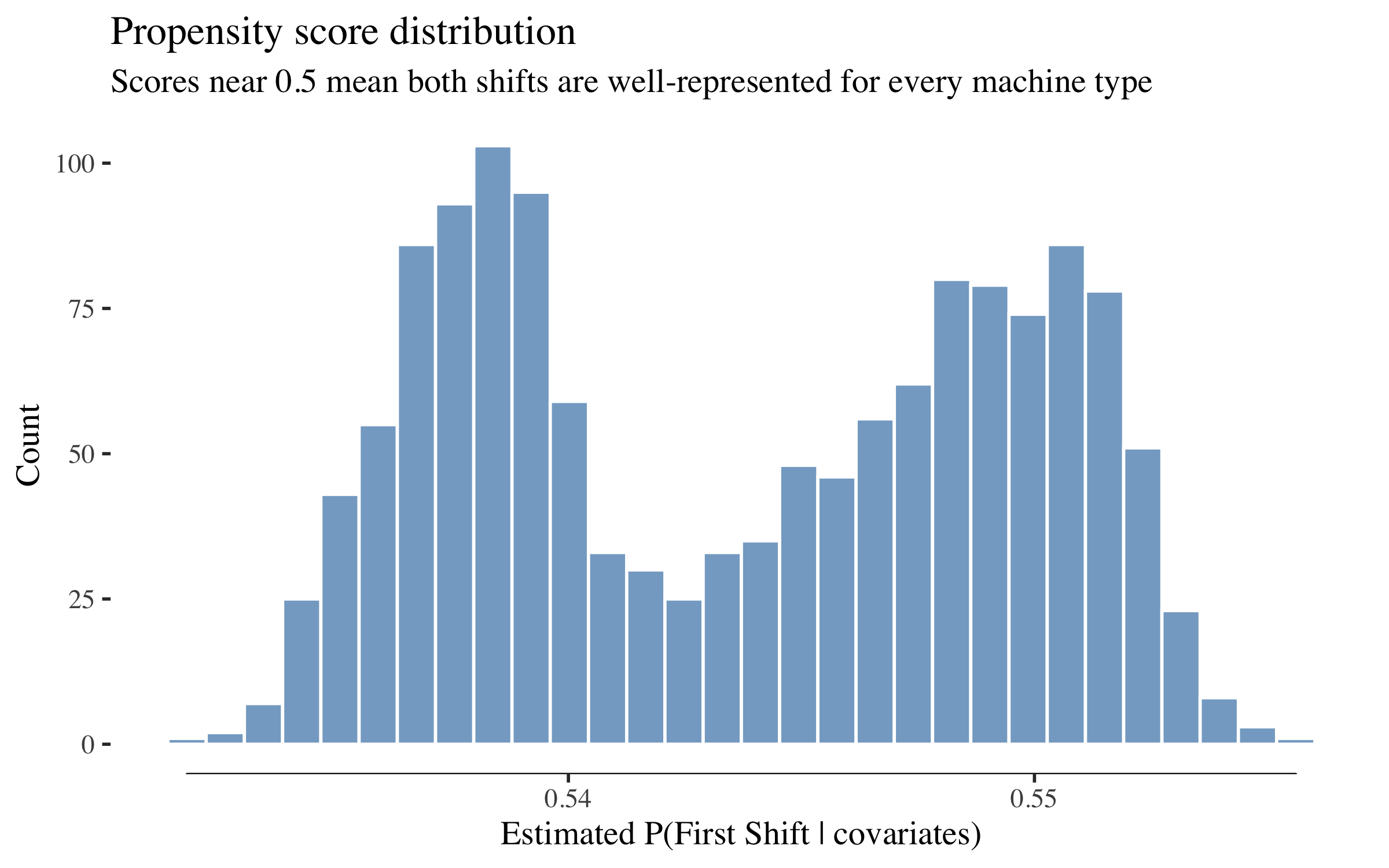
Propensity scores cluster around 0.5 --- exactly where we want them. No machine type is deterministically assigned to one shift, so the causal forest has good "overlap" (both treatment and control observations across the covariate space) for reliable effect estimation.
Heterogeneous treatment effects
tau_hat <- predict(cf)$predictions
df_cf$tau_hat <- tau_hat

ggplot(df_cf, aes(x = tau_hat, fill = machine_group)) +
  geom_histogram(bins = 40, alpha = 0.7, colour = "white",
                 position = "stack") +
  geom_vline(xintercept = ate["estimate"], linetype = "dashed",
             colour = col_fail, linewidth = 0.8) +
  geom_rangeframe(sides = "b") +
  labs(title = "Distribution of individual treatment effects (CATE)",
       subtitle = "Red line = ATE. Clusters correspond to machine groups.",
       x = "Estimated CATE (increase in P(breakdown) from First Shift)",
       y = "Count", fill = "Machine group")
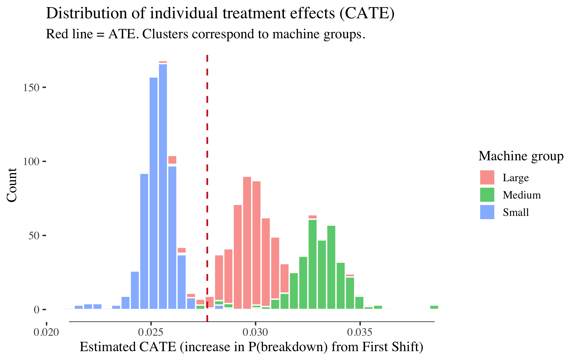
The distribution is bimodal because the only covariates are machine group dummies --- so the causal forest estimates a distinct CATE for each group, and machines within a group cluster tightly. The left mode is Small machines (lower shift effect), the right mode is Medium and Large machines (higher shift effect). The spread within each cluster reflects the forest's honesty (out-of-bag variation), not genuine within-group heterogeneity.
# Variable importance (printed, not plotted --- only 3 covariates)
tibble(
  variable   = cov_cols,
  importance = round(as.numeric(variable_importance(cf)), 3)
) |>
  arrange(desc(importance))
## # A tibble: 3 × 2
##   variable            importance
##   <chr>                    <dbl>
## 1 machine_groupMedium      0.314
## 2 machine_groupLarge       0.292
## 3 machine_groupSmall       0.272
CATE by machine group
cate_table <- df_cf |>
  group_by(machine_group) |>
  summarise(
    n              = n(),
    mean_cate      = mean(tau_hat),
    se_cate        = sd(tau_hat) / sqrt(n()),
    breakdown_rate = mean(breakdown),
    .groups        = "drop"
  ) |>
  arrange(desc(mean_cate)) |>
  mutate(
    `Mean CATE`      = round(mean_cate, 4),
    `95% CI`         = paste0("[", round(mean_cate - 1.96 * se_cate, 4),
                              ", ", round(mean_cate + 1.96 * se_cate, 4), "]"),
    `Breakdown rate`  = paste0(round(breakdown_rate * 100, 1), "%"),
    `Expected cost/machine ($)` = round(mean_cate * 50000, 0)
  )

cate_table |>
  select(machine_group, n, `Mean CATE`, `95% CI`, `Breakdown rate`,
         `Expected cost/machine ($)`)
## # A tibble: 3 × 6
##   machine_group     n `Mean CATE` `95% CI`         `Breakdown rate`
##   <fct>         <int>       <dbl> <chr>            <chr>
## 1 Medium          332      0.033  [0.0328, 0.0331] 4.5%
## 2 Large           474      0.0297 [0.0296, 0.0298] 5.3%
## 3 Small           614      0.0253 [0.0253, 0.0254] 3.1%
## # ℹ 1 more variable: `Expected cost/machine ($)` <dbl>
The table shows the estimated shift effect by machine group --- how much being on First Shift increases breakdown probability for each machine type. The last column translates this into dollars: a mean CATE of 0.03 means that each First Shift assignment on that machine type costs an expected $1,500 in additional breakdown risk (0.03 × $50K). This drives the targeting analysis below: which First Shift machines should we prioritise for intervention?
(Assembly machines, if present, may have too few observations to produce a reliable CATE estimate and will show a very wide CI or be absent from the table entirely.)
A note on the confidence intervals: the CIs above are for the group mean CATE, not for individual machines. The SE of the mean shrinks with \(\sqrt{n}\), so group-level CIs can be tight even when individual CATEs vary. The CATE histogram above shows the individual-level spread, which is considerably wider.
Targeting: the value of knowing where to intervene
The factory manager has a fixed budget for interventions on First Shift machines: extra maintenance windows, operator support, or shift reassignment. The ATE already told us First Shift is riskier. The more interesting question is: given a limited budget, which First Shift machines should we prioritise?
The CATE answers this directly. A machine with a high CATE has a large shift-related excess risk --- it benefits most from being reassigned to Second Shift or receiving additional First Shift support. Even if the budget allows intervening on every First Shift machine, the order matters: CATE-ranked allocation front-loads the highest-risk machines and captures most of the value early. We compare three strategies:
- CATE-ranked: intervene on First Shift machines in order of decreasing CATE (highest shift-related risk first)
- Random: intervene on the same number of machines but chosen at random
- Do nothing: the baseline
| Outcome | Cost | What happens |
|---|---|---|
| Prevented breakdown | saved $50,000 | Avoided emergency repair + downtime |
| Inspection (per machine) | $500 | Targeted check — cheap relative to breakdown |
Each prevented breakdown saves $50K. Each targeted inspection costs $500. The asymmetry is the whole point: even a small shift-related risk premium makes intervention worthwhile for high-CATE machines on First Shift.
cost_per_breakdown <- 50000   # unplanned breakdown: emergency repair + downtime
cost_per_inspection <- 500    # targeted inspection triggered by the model

# Rank by CATE (only First Shift machines --- those are the treatable ones)
first_shift <- df_cf |>
  filter(W == 1) |>
  arrange(desc(tau_hat)) |>
  mutate(
    rank         = row_number(),
    pct_treated  = rank / n(),
    cum_cate     = cumsum(tau_hat),
    expected_prevented = cum_cate,
    expected_savings   = expected_prevented * cost_per_breakdown -
                         rank * cost_per_inspection
  )

# Random baseline: average CATE is constant, so cumulative grows linearly
mean_cate <- mean(first_shift$tau_hat)
first_shift <- first_shift |>
  mutate(
    random_savings = rank * mean_cate * cost_per_breakdown -
                     rank * cost_per_inspection
  )

ggplot(first_shift) +
  geom_line(aes(x = pct_treated, y = expected_savings / 1000,
                colour = "CATE-ranked"), linewidth = 1) +
  geom_line(aes(x = pct_treated, y = random_savings / 1000,
                colour = "Random"), linewidth = 1, linetype = "dashed") +
  geom_hline(yintercept = 0, linetype = "dotted", colour = "gray50") +
  geom_rangeframe(sides = "bl") +
  scale_x_continuous(labels = scales::percent_format()) +
  scale_colour_manual(values = c("CATE-ranked" = col_bar,
                                  "Random" = col_fail)) +
  labs(title    = "Targeting curve: CATE-ranked vs random allocation",
       subtitle = "Both strategies eventually treat everyone — but CATE-ranking front-loads value",
       x = "Fraction of First Shift machines treated",
       y = "Expected net savings ($K)",
       colour = NULL) +
  theme(legend.position = c(0.2, 0.85))
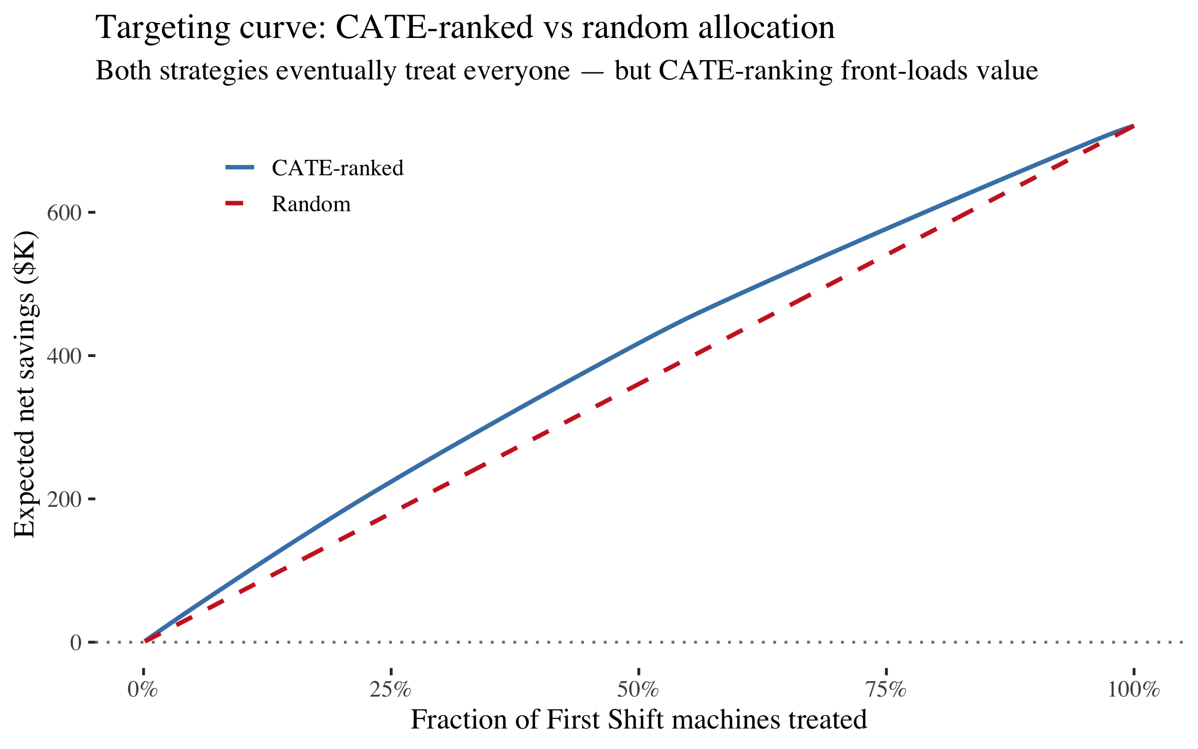
The targeting curve is monotonically increasing here --- because with $500 inspections and $50K breakdowns, even the lowest-CATE First Shift machines are worth intervening on (expected value > cost for nearly all). That's not a failure of the method; it's the economics saying "do something about every machine on First Shift."
But the shape still matters. CATE-ranked allocation captures value faster: at 25% treated, it has already captured a disproportionate share of the total savings. If the budget is limited --- say, you can only inspect or reassign 200 of 774 First Shift machine-shifts --- the CATE ranking tells you exactly which 200.
# Compare CATE-ranked vs random at specific budget levels
budget_pcts <- c(0.25, 0.50, 0.75, 1.00)
n_first <- nrow(first_shift)

comparison <- tibble(
  `Budget (% treated)` = paste0(budget_pcts * 100, "%"),
  `Machines treated`   = round(budget_pcts * n_first),
  `CATE-ranked savings ($K)` = sapply(budget_pcts, function(p) {
    k <- round(p * n_first)
    row <- first_shift |> filter(rank == k)
    round(row$expected_savings / 1000, 1)
  }),
  `Random savings ($K)` = sapply(budget_pcts, function(p) {
    k <- round(p * n_first)
    row <- first_shift |> filter(rank == k)
    round(row$random_savings / 1000, 1)
  })
) |>
  mutate(
    `CATE advantage ($K)` = `CATE-ranked savings ($K)` - `Random savings ($K)`
  )

comparison
## # A tibble: 4 × 5
##   `Budget (% treated)` `Machines treated` `CATE-ranked savings ($K)`
##   <chr>                             <dbl>                      <dbl>
## 1 25%                                 194                       225.
## 2 50%                                 387                       417.
## 3 75%                                 580                       577.
## 4 100%                                774                       721.
## # ℹ 2 more variables: `Random savings ($K)` <dbl>, `CATE advantage ($K)` <dbl>
The advantage of CATE-ranking is largest at small budgets. As you approach 100% the gap narrows to zero (because eventually you're intervening on every First Shift machine regardless of order). This is the practical value of heterogeneous treatment effects: they tell you the optimal order of intervention, even when the optimal quantity turns out to be "all of them."
# Summary stats
optimal <- first_shift |> slice_max(expected_savings, n = 1)
quarter <- first_shift |> filter(rank == round(0.25 * n_first))
random_quarter <- first_shift |> filter(rank == round(0.25 * n_first))

tibble(
  metric = c(
    "Machines on First Shift",
    "ATE (mean CATE)",
    "Expected cost per First Shift assignment",
    "Full intervention savings",
    "CATE-ranked savings at 25% budget",
    "Random savings at 25% budget",
    "Advantage of CATE-ranking at 25%"
  ),
  value = c(
    nrow(first_shift),
    paste0(round(mean_cate, 4), " (", round(mean_cate * 100, 2), " pp)"),
    paste0("$", format(round(mean_cate * cost_per_breakdown), big.mark = ",")),
    paste0("$", format(round(optimal$expected_savings), big.mark = ",")),
    paste0("$", format(round(quarter$expected_savings), big.mark = ",")),
    paste0("$", format(round(random_quarter$random_savings), big.mark = ",")),
    paste0("$", format(round(quarter$expected_savings - random_quarter$random_savings),
                        big.mark = ","))
  )
)
## # A tibble: 7 × 2
##   metric                                   value
##   <chr>                                    <chr>
## 1 Machines on First Shift                  774
## 2 ATE (mean CATE)                          0.0286 (2.86 pp)
## 3 Expected cost per First Shift assignment $1,431
## 4 Full intervention savings                $720,768
## 5 CATE-ranked savings at 25% budget        $224,588
## 6 Random savings at 25% budget             $180,658
## 7 Advantage of CATE-ranking at 25%         $43,930
What we learned
The treatment effect is real but modest (~3 pp), the mediation path turned out non-significant, and the targeting curve says "inspect everyone." That's fine. The value of the causal approach here isn't a flashy headline number --- it's the mistakes it prevented. Without the DAG, a naive model would have identified run_hours as the strongest "predictor," prescribed longer shifts as the intervention, and entirely missed the reverse causation. The causal framework caught that before it reached a decision-maker.
| Step | Tool | What it told us |
|---|---|---|
| Association | Rate plots | First Shift = 2x breakdown rate; short runs = reverse causation; changeovers associate with risk |
| Structure learning | bnlearn |
Data finds edges — including energy as a hub — but can't orient them or distinguish causes from consequences |
| DAG | dagitty |
Breakdown → run_hours (not the reverse); changeovers mediate part of the shift effect; don't condition on descendants |
| Test | localTests |
The DAG's predictions are consistent with the data |
| Identify | adjustmentSets + dosearch |
Total effect: no adjustment needed (shift is exogenous). Direct effect: adjust for {changeovers, machine_group} |
| Estimate | Logistic + sandwich SEs |
Shift effect is real; including run_hours attenuates it (collider bias) |
| Cost of bias | Coefficient comparison | The biased model finds the wrong predictor and prescribes the wrong intervention |
| Causal ML | grf::causal_forest |
Shift effect varies by machine group; some machine types have a much larger First Shift risk premium |
| Targeting | CATE ranking | CATE-ranked intervention on First Shift machines front-loads value; at constrained budgets, the ranking matters more than the quantity |
The thread running through all of it: the DAG determines the analysis. Without it, we'd include run_hours as a predictor (collider bias), mistake the short-run/breakdown correlation for causation (reverse causation), include energy because "the algorithm said so" (associational red herring), and build a model that finds patterns rather than causes. The CATE analysis adds a further layer: even when the right intervention is "do something about every First Shift machine," the causal forest tells you the optimal order --- which machine types to prioritise for shift reassignment or extra maintenance when budgets are tight.
The talk ends with an Industrie 4.0 stack where the Digital Twin sits atop the sensor layer: data flows up, but *causal reasoning flows down from the DAG to the adjustment set to the estimate to the decision.